How to make Blog Post Image Responsive?
We have great collection of amazing looking video theme, You can download any theme you like for free. By using these themes, your blog is with an extraordinary feel of professionalism and style. Meanwhile continue reading How to make Blog Post Image Responsive?.
Read Also!
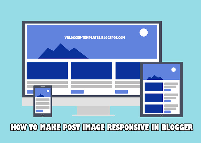
Today's trend in blogging is how to make your templates responsive, that it can adapt in any kinds of devices e.g. PC, Laptop, mobile, tables etc. This is also a challenge on the part of every website/blog administrator.
There are instances that yes your templates is responsive but when your posting image/photos it display larger and some would even go out of the blog post body when seen in other devices.
Now to solve this issue, we have to make your image post responsive.
Just simply follow the steps below:
Step #1: Log in to your Blogger Account and Go to your Blogger Dashboard
Step #2: Click ->Template -> Edit HTML
Step #3: Find ]]></b:skin> by Pressing CTRL + F (Windows) or CMD + F (MAC)
Step #4: Now paste the below code above/before ]]></b:skin>
Step #5: Now hit Save Template
The code width is define 100%, this means that image will be the same width according to your blog post width while the height is set auto.
That's all for this tutorials. To all visitors thank you for dropping by at vbt blog.
Happy Blogging!
There are instances that yes your templates is responsive but when your posting image/photos it display larger and some would even go out of the blog post body when seen in other devices.
Now to solve this issue, we have to make your image post responsive.
Just simply follow the steps below:
Step #1: Log in to your Blogger Account and Go to your Blogger Dashboard
Step #2: Click ->Template -> Edit HTML
Step #3: Find ]]></b:skin> by Pressing CTRL + F (Windows) or CMD + F (MAC)
Step #4: Now paste the below code above/before ]]></b:skin>
.post-body img {
max-width:100%;
height:auto;
}
Step #5: Now hit Save Template
The code width is define 100%, this means that image will be the same width according to your blog post width while the height is set auto.
That's all for this tutorials. To all visitors thank you for dropping by at vbt blog.
Happy Blogging!


